Fact Checker
An app for checking a forwarded claim in two minutes, designed where most misinformation arrives as a screenshot rather than a link.
The problem
In India a false claim usually reaches you as an image: a screenshot of a news bulletin, a poster, a photograph with text burnt into it, forwarded by someone you trust. Existing fact-checking sites are written for a link and for a reader who has already decided to be sceptical. Neither assumption holds on a family group at nine in the evening.
- Platform
- Mobile app concept
- Timeline
- 2022
- My role
- Product design and UI
- Made at
- Inclusive Minds
-
The promise
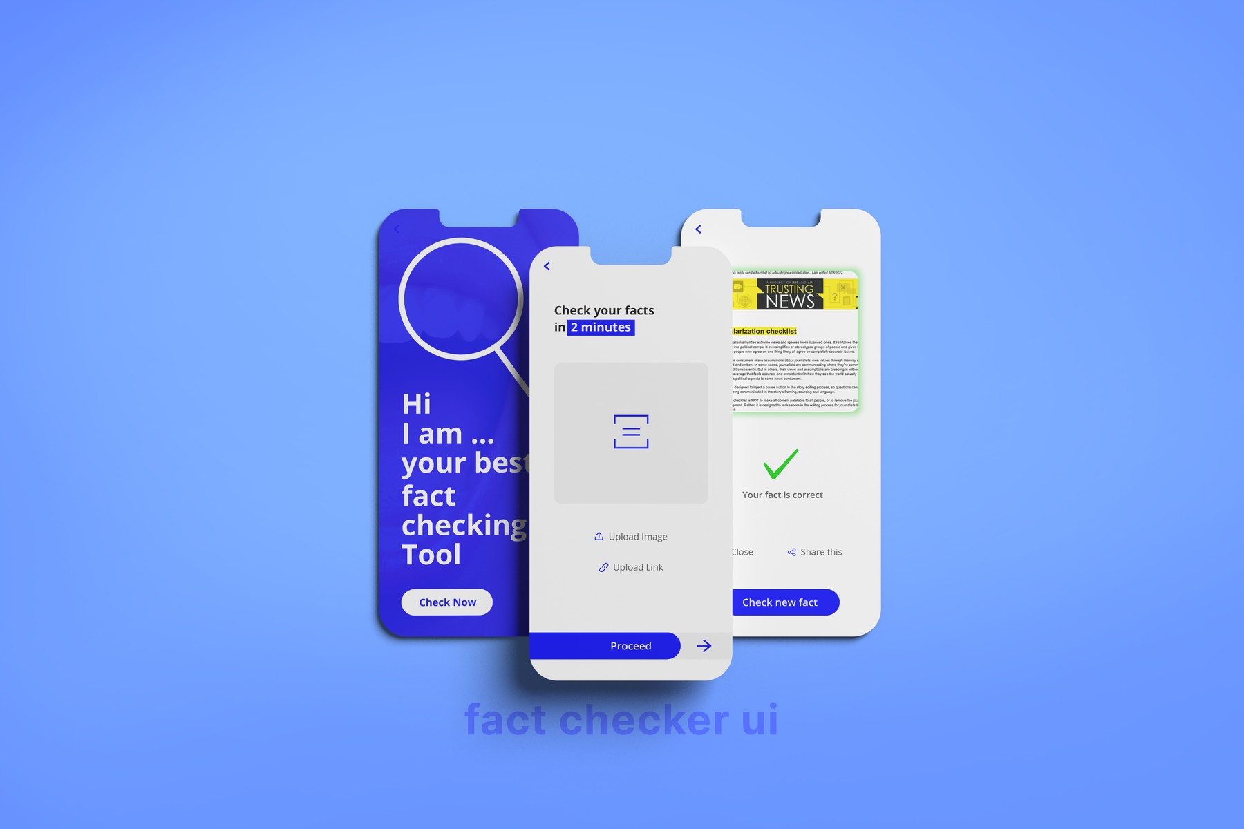
The headline commits to a number: check your facts in two minutes, with the two minutes highlighted. It is a design constraint disguised as a line of copy. Everything after it has to earn its place against that clock, which is what killed the account, the onboarding and the feed.
-
Image first
Upload Image sits above Upload Link, in that order, because that is the order the claims arrive in. Accepting a screenshot means someone can act on the thing already open in their hand rather than hunting for a source they were never sent.
-
Evidence above verdict
The result screen shows the source card before the tick: the checklist, the bulletin, the thing the answer rests on. A verdict alone asks to be believed, which is the same demand the false claim made. Showing the working is the difference between correcting someone and out-shouting them.
-
Close the loop
Share this sits beside Close, so the correction can travel back down the chain the claim came from. A fact check that ends on one person’s screen has not finished. Check new fact then resets the flow, because in practice nobody arrives with only one thing to check.
Outcome
Concept, three screens. Designed at Inclusive Minds.
A fact-checking tool designed at Inclusive Minds in 2022, in a year of elections and a country where a WhatsApp forward moves faster than any newsroom correction.
The work mattered to what Inclusive Minds was doing because everything else in the practice was upstream of this problem. Campaigns, posters, the writing, all of it was arguing for a version of events against a flood of cheaper, faster, angrier material. A tool that let an ordinary person check one claim in the two minutes they actually have is a different kind of intervention: it does not try to win the argument, it hands over the means to settle it.
The design question was narrow and hard. Not how do we build a fact-checking database, which is a journalism problem, but what does the interface have to do so that a person under social pressure, in a group chat, still uses it? Two minutes. No account. Take a screenshot, because that is what they were sent. Show the evidence before the answer, so it can be forwarded and defended rather than just asserted.
One thing I would argue with now: the result screen says your fact is correct with a green tick, and most claims worth checking do not resolve that cleanly. A verdict this binary is easy to read and easy to misuse. A later version would need a middle: partly true, missing context, unverified, and the discipline to sit in it rather than round to a tick.
The project
Credits
- Made at Inclusive Minds
- Concept and design Rabi [Rabiul Islam]
- Status Product concept