One decision, made once
Approve is the same green in the leave queue, the expense screen and the hiring pipeline, because it is the same act. Nobody has to relearn the interface per module, and nobody has to ask a designer what green means.
A product concept for an all-in-one HR and work platform: what happens to a company when everything it runs on stops living in different tabs.
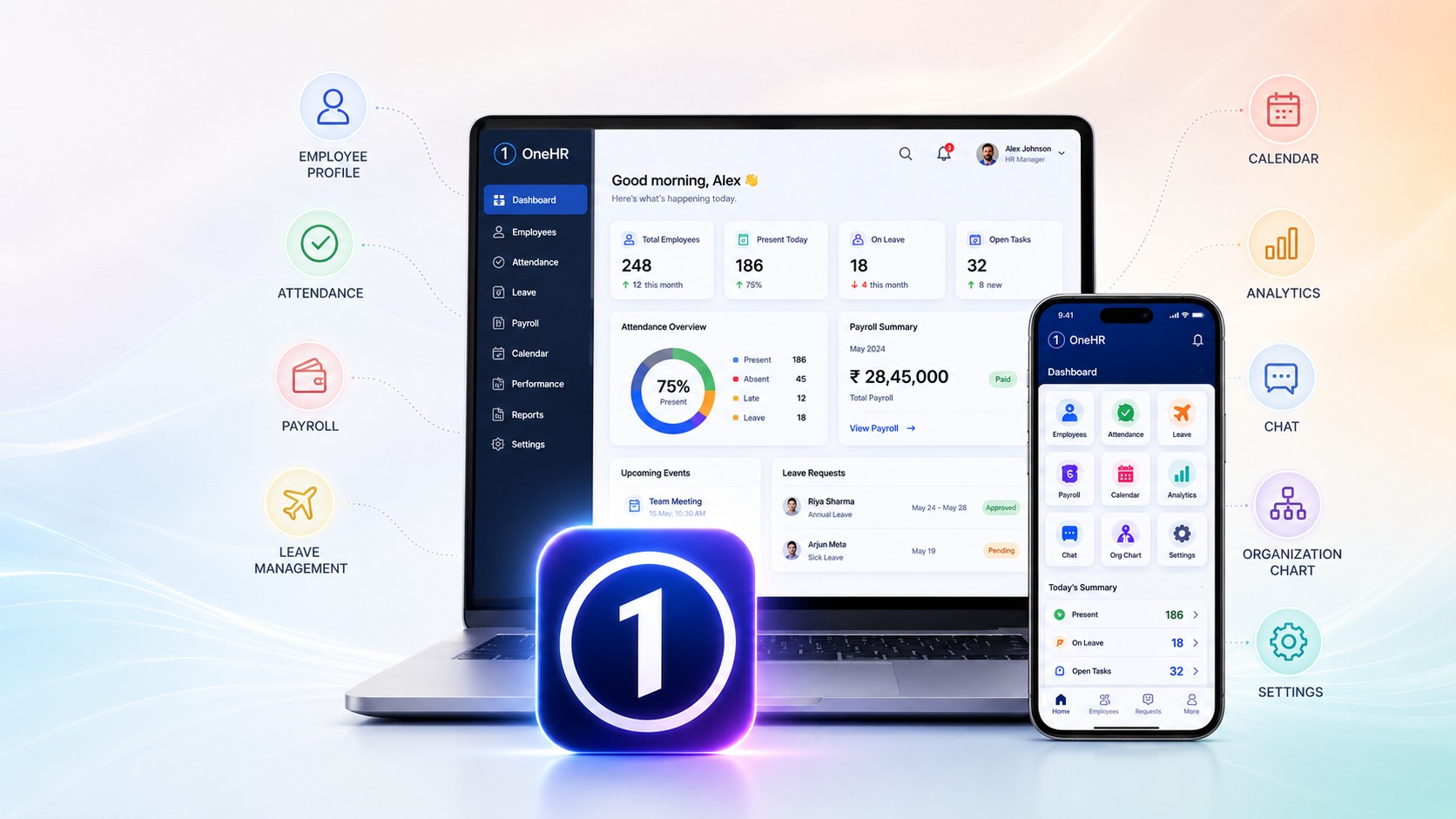
Leave sits in one tool, tasks in another, the policy nobody can find is a PDF in a shared drive, and your goals are in a document last opened in January. Every tool works. The cost is the seams between them.
Phases mapped against verticals before a single screen was drawn, because an all-in-one product fails by becoming a drawer of unrelated tools behind one login.
The site map deliberately fanned out to its real contents and then pulled back. Thirty-odd destinations resolved into six doors.
Six tiles on an illustrated home; performance as rings and counts rather than scores; a leave queue dense enough to clear eleven requests without leaving the row.
Tasks read from ClickUp rather than replacing it. A product that insists on owning every workflow loses to the tool teams already like.
Concept, 19 screens. Not built.
Most organisations do not have an HR problem. They have a where is it problem. Leave sits in one tool, tasks in another, the policy nobody can find is a PDF in a shared drive, the job you are hiring for is on a portal only recruitment logs into, and your own goals are in a document your manager wrote in January and neither of you has opened since. Every one of those tools works. The cost is in the seams between them.
This is a concept for closing those seams: a single signed-in place holding performance, tasks, the HR portal, an internal wiki, careers, and the record of who does what. It was designed for one organisation, but nothing in it is specific to that one, which is why the marks are off the screens here. It could be yours.
Starting with the map, not the screens. The first four boards are not interface at all. They are the architecture argued out: a matrix of phases against verticals, then a site map exploration, then the same map deliberately converged and diverged, then the final one. That order matters. Every all-in-one product fails the same way, by becoming a drawer of unrelated tools behind one login, and the only defence is deciding early what belongs together and what merely arrived together.
The converging and diverging board is the one that did the work. Work management, workflow references, employee management, about the organisation, contacts, all fanned out into their real contents and then pulled back to a single home. What came out of it was six doors rather than a menu of thirty items.
The problem with a home screen for everything. A landing page for an all-in-one product has to answer a question no single-purpose tool ever faces: what am I here for today? A list of thirty links answers it badly, because the person scanning it is not browsing, they are on their way somewhere and being slowed down.
So the home is an illustrated field of the work itself, with six tiles under it: About Us, HR portal, Career, Wiki, Performance, Task Management. Six is small enough to take in without reading. The illustration is doing real work too, not decoration: it is the reason the screen does not feel like an intranet, and it buys the tiles enough visual quiet to be scanned in one pass.
Performance, shown as a shape rather than a score. Appraisal interfaces usually fail by being honest only once a year and hostile the rest of the time. The performance view answers a different question, the one people actually ask: am I on track this week? A ring for progress, a weekly line for work against timing, and four plain counts, total, done, doing, open. The month view repeats it as twelve rings so a year reads as a rhythm and a bad March is visible as a shape, not buried in a spreadsheet.
Nothing here needs a number to be interpreted before it means something. That is the point. The instant a metric needs explaining, people stop looking at it, and an unlooked-at dashboard is worse than none because it still gets cited in reviews.
The wiki, and refusing to be clever. The internal knowledge base opens on a line that sets the tone: we are not into rocket science, everyone is capable. Then a search field and faceted filters by phase, category and space. The UX problem in every company wiki is not storage, it is that people do not believe the answer is in there, so they ask a colleague instead and the wiki decays further. The fix is not more documents. It is search that returns something on the first try and filters that match how work is actually grouped, which is why the facets are phases and spaces rather than departments.
Hiring, from both sides of the table. Careers carries the same job list twice over, in two different interfaces, because two different people need it. A candidate gets search, filters and a Refer button. The recruiter gets the pipeline as four counts, applied, reviewed, interviewed, offered, with each role showing where its applicants have got stuck and when. One dataset, two products. Building it once and styling it twice would have served neither.
Leave, where most HR tools lose people. The approval queue is deliberately dull and dense: who asked, what type, the dates, how much they have taken against their balance, and Approve or Reject in the same row. No modal, no second screen, no navigating away and losing your place. A manager clearing eleven requests on a Monday morning is the real user here, and the measure of the design is whether that takes two minutes or twenty.
What it would do for an organisation. Fewer tools is the obvious answer and the least interesting one. The real gain is that the same facts stop being kept in several places at once. When leave, capacity, tasks and goals sit in one system, a manager approving time off can see what it costs the sprint, and a review can be based on the record rather than on memory. It also makes the quiet things visible: who is carrying too much, which roles have been open too long, which policies nobody has ever opened.
The task view integrates with ClickUp rather than replacing it, which is the honest position for a concept like this. An all-in-one product that insists on owning every workflow will lose to the tool teams already like. One that absorbs the reporting and leaves the doing where it is has a chance.
Two ways in and one menu, because the alternative is a different landing page per role and three versions of every screen after it. What a role can reach is added to the same flow rather than forking it.
Way in
The one menu
Destinations
What sits behind
Everyone Team lead only HR only
A manager clearing a leave request, the task the old tool made take twenty minutes. Watch it or step it.
Queue clear. Two left for tomorrow.
Working interface. Use the rail or the tiles, tick a filter, approve a request.
50%
Work management Timing
Phase
Space
Search across every project
Nothing under those filters.
Reads from ClickUp rather than replacing it. A product that insists on owning every workflow loses to the tool people already like; one that absorbs the reporting and leaves the doing alone has a chance.
Mission, structure and who to ask. It earns its door because a new joiner needs it in week one, and because burying it is how a company ends up answering the same question in chat forever.
The interface above is not styled screen by screen. It is assembled from these, and so is every screen after it. Each swatch below is painting itself with the token it names.
--hz-ink Headings, numerals, anything that has to be read first --hz-soft Body, labels, the second thing you read --hz-line Card edges, dividers, the track behind a bar --hz-ground Card and panel backgrounds --hz-blue Progress, the active state, the one action per screen --hz-good Completed, approved, within balance --hz-warn In progress, approaching a limit --hz-stop Destructive only. Never decoration --hz-fs-xl A number you read across a room --hz-fs-lg What this area is for --hz-fs-md Rows, descriptions, help --hz-fs-sm Field names, table heads --hz-fs-xs Counts, dates, balances --hz-1 --hz-2 --hz-3 --hz-4 --hz-5 Approve is the same green in the leave queue, the expense screen and the hiring pipeline, because it is the same act. Nobody has to relearn the interface per module, and nobody has to ask a designer what green means.
An all-in-one platform adds modules forever. With tokens and a component set, a new module is assembled rather than designed, so the fifteenth screen costs a fraction of the first and does not drift away from it.
Contrast is decided once in the tokens and inherited everywhere, so it cannot be lost in a screen nobody thought to check. Focus rings, hit areas and the dark theme come from the same place.
A build conversation becomes "primary, space 3, label size" instead of a marked-up screenshot. Engineering reads the same vocabulary the design does, which is where most of the loss between the two usually happens.