Vanya brand identity
An identity for a Himalayan honey and farm brand, drawn from the ridgeline itself.
The problem
A Himalayan honey and farm brand selling direct to the buyer, sitting between four things that usually pull apart: mountains and community, craft and tourism, sustainability, and a market willing to pay for all three.
- Platform
- Identity, packaging and a shopfront app
- Timeline
- 2022
- My role
- Brand identity, art direction, UI
- Made at
- Vanya
-
Position
Four overlapping circles rather than a single claim, because a brand built on any one of them would be a lie about the other three.
-
Mark
Assembled from the concept note and nothing else: mountains and water, soil colour, connected people, level ground and a direct line, craft. The parts spell the name, so the wordmark is the diagram.
-
System
Palette taken off the same ground, Open Sans throughout because a hill-town label cannot depend on a licensed display face, and a scatter element to do the decorating so the mark never has to.
-
Product
Carried into a shopfront app selling directly from Himalaya, which is where the direct line in the concept note stops being a metaphor.
A brand identity for Vanya, selling honey and farm produce from the Himalaya direct to the buyer. Positioning, mark, palette, pack, stationery, social and the look of the app.
The brand sits where four things meet: mountains, forest and community; art, craft and tourism; sustainability; and a self-conscious market willing to pay for both. A brand built on any one of those alone would be a lie about the other three, so the identity had to hold all four at once.
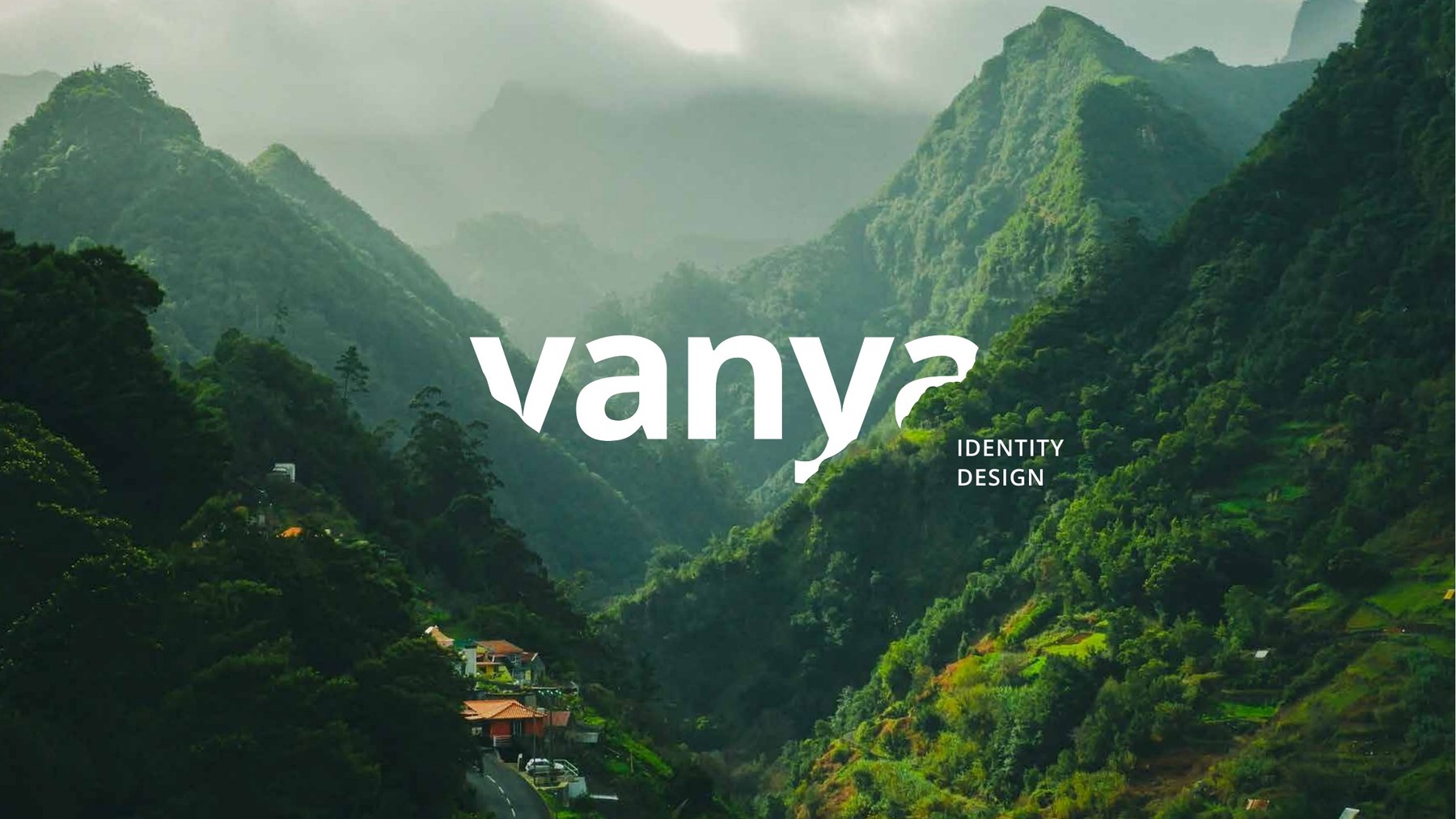
The concept note the work is built on is one sentence: the people of soil are creating a connection. The mark is assembled from exactly that, and nothing else. A wavy line for mountains and water. The colour of soil. A group of connected people. A straight rule for level ground and a direct line from grower to buyer. And the curl on the tail of the y, for craft and the femininity of nature. Put together they spell the name, so the wordmark is the diagram rather than a decoration applied to it.
The palette is taken off the same ground: soil brown, charcoal, an orange for honey, an olive for the hills, and a cream. Open Sans throughout, because a farm brand that has to print a label in a hill town cannot depend on a licensed display face. The one loose element is a scatter of lines and dots, drawn from the same hand as the mountain line, which does the decorating so the mark never has to.
It runs across the stationery and into a shopfront app selling directly from Himalaya, which is where the direct line in the concept note stops being a metaphor.
The project
Credits
- Client Vanya
- Concept and design Rabi [Rabiul Islam]